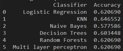
import pandas as pd
import matplotlib.pyplot as plt
import seaborn as sns

# Load the CSV data into a pandas data frame
data = pd.read_csv('data.csv')

# Save histograms of data distribution for 'Age', 'Gender', and 'Selector'
plt.figure()
data['Age'].hist()
plt.savefig('age_histogram.png')

plt.figure()
data['Gender'].hist()
plt.savefig('gender_histogram.png')

plt.figure()
data['Selector'].hist()
plt.savefig('selector_histogram.png')

# Save correlation heatmap of the data set
plt.figure()
corr = data.corr()
sns.heatmap(corr, annot=True)
plt.savefig('correlation_heatmap.png')

# Identify top 5 features with highest absolute correlation with 'Selector'
correlation_with_selector = corr['Selector'].abs().sort_values(ascending=False)
top_5_features = correlation_with_selector[1:6]
# Exclude 'Selector' itself
print(top_5_features)Gen AI - Data Analysis & Mining
One of the final tasks performed by a data engineer is to analyze the final data, draw insights from it, and employ data mining strategies to extract hidden patterns in the data distribution. We will use generative AI for creating Python codes that can perform the required data analysis and data mining strategies.
Scenario
As a senior data engineer for a healthcare company, you are tasked to perform data analysis and data mining on patients’ health records indicating whether or not the patient has been identified with a liver disease or not. Other teams have recorded and cleaned the data that is ready for analysis.
Objectives
We will learn how to use generative AI to:
- Perform exploratory data analysis on a given data set.
- Perform data mining on the given data set and draw insights from the data.
Data set
For the purpose of this lab, we are making use of the Indian Liver Patient Dataset, publically available under the Creative Commons Attribution 4.0 International (CC BY 4.0) license. You may refer to the data set web page for more details on the attributes.
The data set is available for use in this lab at the following URL: URL = “https://cf-courses-data.s3.us.cloud-object-storage.appdomain.cloud/IBMSkillsNetwork-AI0273EN-SkillsNetwork/labs/v1/m2/data/ILPD.csv”
EDA
With exploratory data analysis, you can identify the type of data distribution and how different variables affect each other. In this task, you will use generative AI to create a code that does the following:
Create a histogram plot of the data based on the ‘Age’, ‘Gender’ and ‘Selector’ attributes.
Create a correlation heat map for the data set.
Select the top 5 features with the highest correlation value with the ‘Selector’ attribute.
Input 1
For a given data set available in a CSV format, write a python code that does the following:
- Load the CSV data to a pandas data frame assuming the first row of the CSV contains the headers of the data.
- Save an image to disk, containing histograms of the data distribution with respect to a continuous attribute ‘Age’ and discrete attributes ‘Gender’ and ‘Selector’.
- Save an image to disk containing the correlation heatmap of the data set.
- Identify the top 5 features with highest absolute correlation with the attribute
Selector.
Response 1
Modify Code
import pandas as pd
import matplotlib.pyplot as plt
import seaborn as sns

# Load the CSV data into a pandas data frame
data = pd.read_csv('https://cf-courses-data.s3.us.cloud-object-storage.appdomain.cloud/IBMSkillsNetwork-AI0273EN-SkillsNetwork/labs/v1/m2/data/ILPD.csv')

# Save histograms of data distribution for 'Age', 'Gender', and 'Selector'
plt.figure()
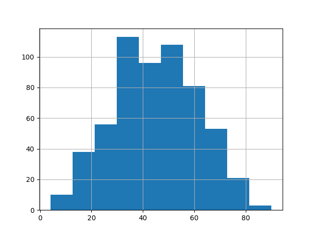
data['Age'].hist()
plt.savefig('age_histogram.png')

plt.figure()
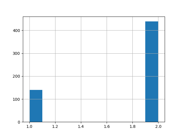
data['Gender'].hist()
plt.savefig('gender_histogram.png')

plt.figure()
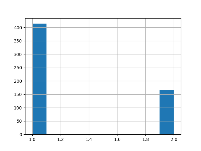
data['Selector'].hist()
plt.savefig('selector_histogram.png')

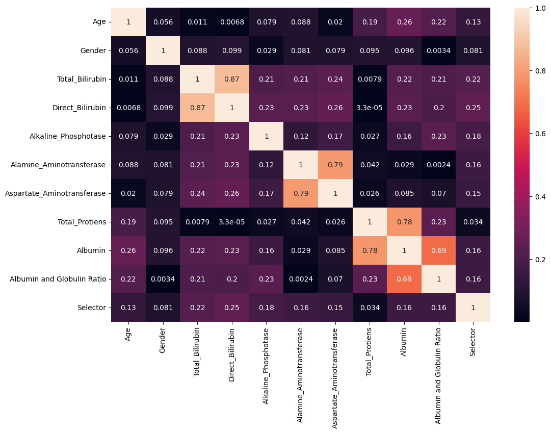
# Save correlation heatmap of the data set
plt.figure(figsize=(12,8))
corr = data.corr()
sns.heatmap(abs(corr), annot=True)
plt.savefig('correlation_heatmap.png', bbox_inches='tight')

# Identify top 5 features with highest absolute correlation with 'Selector'
correlation_with_selector = corr['Selector'].abs().sort_values(ascending=False)
top_5_features = correlation_with_selector[1:6]
# Exclude 'Selector' itself
print(top_5_features)
Age Histogram
Gender Histogram
Selector Histogram
Correlation Heatmap
Data Mining
With exploratory data analysis, you can identify the type of data distribution and how different variables affect each other. In this task, you will use generative AI to create a code that does the following:
Create a histogram plot of the data based on the ‘Age’, ‘Gender’ and ‘Selector’ attributes.
Create a correlation heat map for the data set.
Select the top 5 features with the highest correlation value with the ‘Selector’ attribute.
Input 1
For a given data set available in a CSV format, write a python code that does the following:
- Load the CSV data to a pandas data frame assuming the first row of the CSV contains the headers of the data.
- Save an image to disk, containing histograms of the data distribution with respect to a continuous attribute ‘Age’ and discrete attributes ‘Gender’ and ‘Selector’.
- Save an image to disk containing the correlation heatmap of the data set.
- Identify the top 5 features with highest absolute correlation with the attribute
Selector.
Response 1
import pandas as pd
import matplotlib.pyplot as plt
import seaborn as sns

# Load the CSV data into a pandas data frame
data = pd.read_csv('data.csv')

# Save histograms of data distribution for 'Age', 'Gender', and 'Selector'
plt.figure()
data['Age'].hist()
plt.savefig('age_histogram.png')

plt.figure()
data['Gender'].hist()
plt.savefig('gender_histogram.png')

plt.figure()
data['Selector'].hist()
plt.savefig('selector_histogram.png')

# Save correlation heatmap of the data set
plt.figure()
corr = data.corr()
sns.heatmap(corr, annot=True)
plt.savefig('correlation_heatmap.png')

# Identify top 5 features with highest absolute correlation with 'Selector'
correlation_with_selector = corr['Selector'].abs().sort_values(ascending=False)
top_5_features = correlation_with_selector[1:6]
# Exclude 'Selector' itself
print(top_5_features)
Modify
import pandas as pd
import matplotlib.pyplot as plt
import seaborn as sns

# Load the CSV data into a pandas data frame
data = pd.read_csv('https://cf-courses-data.s3.us.cloud-object-storage.appdomain.cloud/IBMSkillsNetwork-AI0273EN-SkillsNetwork/labs/v1/m2/data/ILPD.csv')

# Save histograms of data distribution for 'Age', 'Gender', and 'Selector'
plt.figure()
data['Age'].hist()
plt.savefig('age_histogram.png')

plt.figure()
data['Gender'].hist()
plt.savefig('gender_histogram.png')

plt.figure()
data['Selector'].hist()
plt.savefig('selector_histogram.png')

# Save correlation heatmap of the data set
plt.figure(figsize=(12,8))
corr = data.corr()
sns.heatmap(abs(corr), annot=True)
plt.savefig('correlation_heatmap.png', bbox_inches='tight')

# Identify top 5 features with highest absolute correlation with 'Selector'
correlation_with_selector = corr['Selector'].abs().sort_values(ascending=False)
top_5_features = correlation_with_selector[1:6]
# Exclude 'Selector' itself
print(top_5_features)